Histograms of general BLAST statistics
A picture is worth a thousand words… so SequenceServer includes various visual aids to assist researchers. These now include histograms summarizing the general distribution of E-values and other metrics for your BLAST search.
The many statistics of BLAST
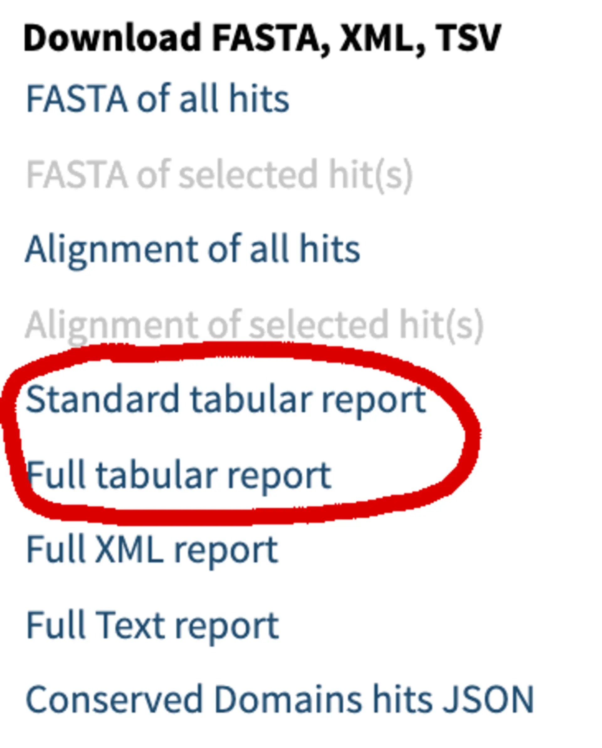
BLAST calculates and provides many metrics and properties describing the alignments it identifies. From alignment lengths to numbers of mismatches, the full BLAST result table includes 52 columns of information. Alongside SequenceServer’s interactive BLAST results, you can download a normal BLAST result table or a full table that includes all possible information.
Those tables can be helpful for making custom plots in R or Excel.
SequenceServer plots important BLAST statistics
SequenceServer now generates five plots, each providing a different overview of your BLAST analysis:
- Distribution of E-values
- Distribution of sequence similarities
- Numbers of HPSs (aligning chunks) per hit
- Query coverage per HSP
- Query coverage per query sequence
These are particularly useful if you’re blasting many sequences (e.g., to find all the genes from a gene family in one or multiple target genomes), or to identify all the homologs of a protein in a large database.
E-value distribution
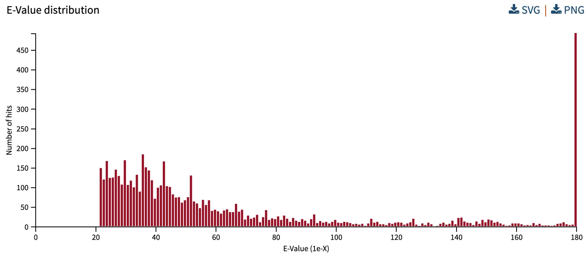
The E-value reflects the likelihood of finding a hit by chance in a particular search. Here, we provide an overview of E-values from all the hits. The X-axis represents the E-value, and the Y-axis represents the number of hits with a given E-value. In the search below, all hits have E-values stronger than 1e-20, suggesting that this BLAST analysis has many strong hits. SequenceServer bins E-values smaller than 1e-180 into the “180” category.
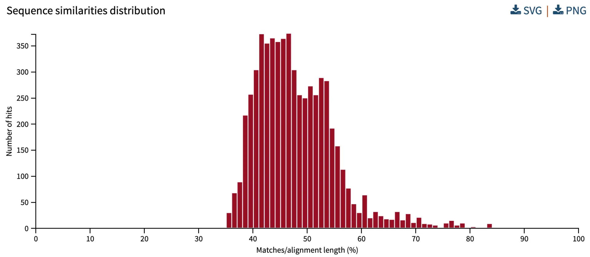
Distribution of sequence similarities
BLAST reports the similarity for each aligning chunk (i.e., each “HSP” or “High Scoring Pair”). Similarity goes from 0% to 100% (i.e., identical query and hit sequences). In the analysis below, most aligning sequences from the database have 35% to 60% similarity to query sequences.
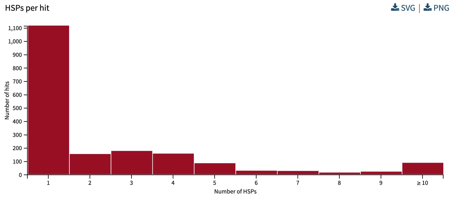
Numbers of HPSs (aligning chunks) per hit
High Scoring Pairs (HSPs) are the segments that align between the query and subject/hit. If a query aligns to a database sequence in one chunk, there is a single HSP – this happens when there is very high similarity and when there are no structural differences or major gaps between query and hit sequences. If there is a major gap (e.g., an intron), or a rearrangement (e.g., a translocation, INDEL), then there will be multiple HSPs. There can also be multiple HSPs when there are multiple conserved regions between the query and hit sequences, but they are separated by divergent regions. If comparing protein sequences, it can be informative to compare the locations of HSPs with the annotation of conserved domains. In our analysis below, the histogram shows that for most database hit sequences, there is one HSP, while some have two or more HSPs.
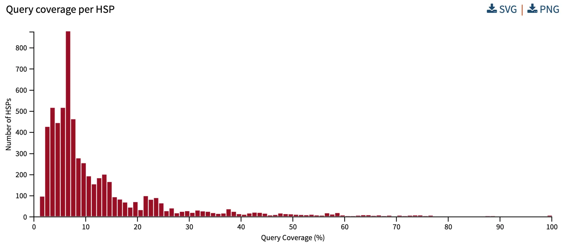
Query coverage per HSP
Query coverage explains the percentage of the query sequence covered by the alignment. Understanding the query coverage per HSP helps to inform how much coverage is captured by one HSP. If we have a single HSP per query, and there is extremely high similarity, we would expect the query coverage to be close to 100%.
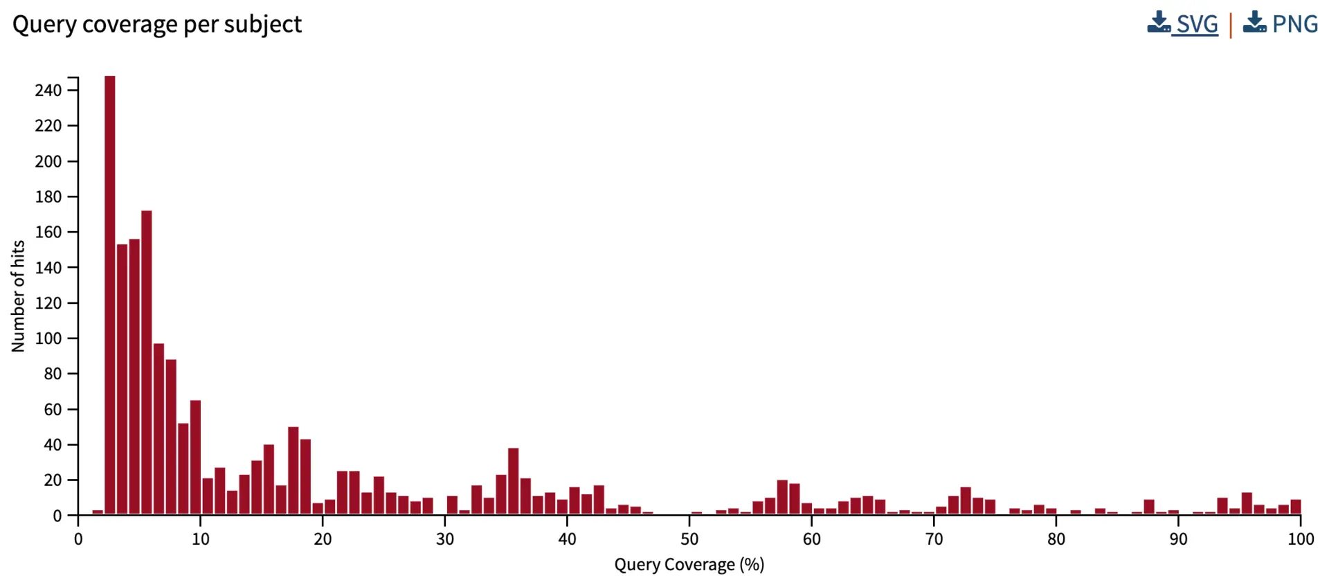
Query coverage per subject
We also summarize the subject/hit coverage. This metric combines the query coverage of all HSPs of a hit, without any duplication of overlapping HSP regions. Therefore, this is helpful for summarizing the total coverage percentage of the query sequence. Note that with sequences that are slightly divergent, we might have 100% coverage (i.e., the entire sequence aligns) despite having only 80% sequence identity (i.e., 20% of the amino acids or nucleotide residues differ).
More visualizations?
We’ve designed SequenceServer to provide what we believe are the most useful visualizations for BLAST analyses - check some more out here. Are there any others that you feel might help? We would love to hear your thoughts. Feel free to email us with suggestions.
Happy BLASTing!

